Zettle – Help centre
Client: Zettle by PayPal (formerly iZettle)
Role in project: Art director, Designer
Made while employed at Zettle by PayPal.
All design needs to be geared to the user and easy to understand, but this is especially important in the case of a service that is supposed to help users that might already be frustrated with your product, and just want to find answers quickly. That is part of what made this project so fun and challenging to work with.
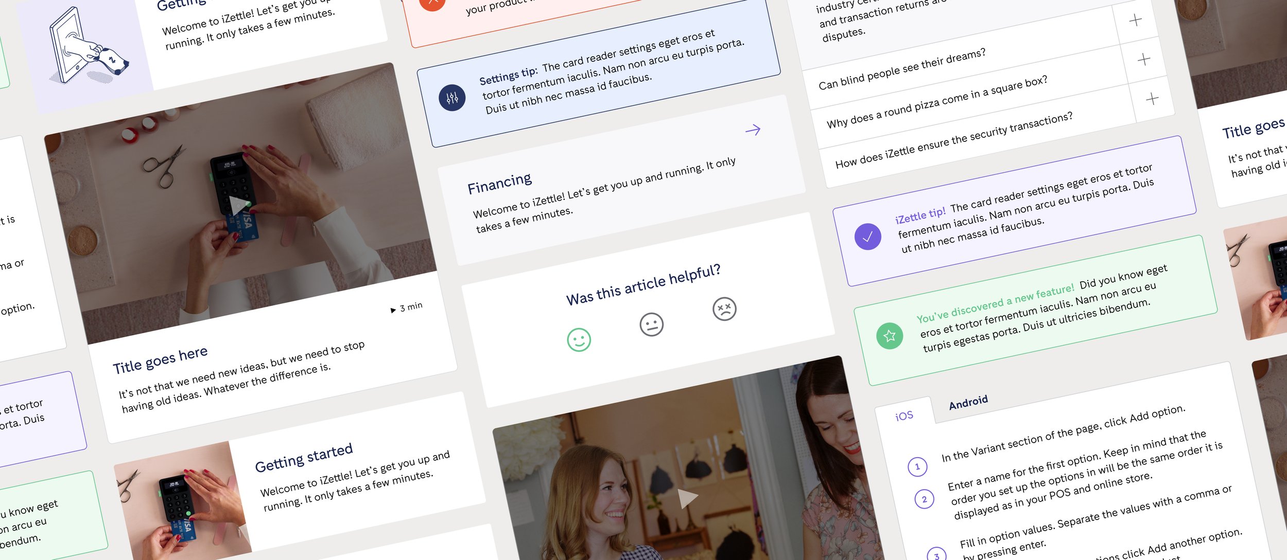
The importance of a quick overview
Designing a startpage that is quick to digest and does not create too much cognitive load was crucial. At first glance the user needs to be able to tell how to search for answers and preferably receive a few nudges and suggestions if they’re at a loss for words. In this case we went with a large search bar, search term suggestions and collections of guides and topics that may interest the user– all above the fold.
Adjacent to the footer on all pages is a section that quickly gives the user access to direct contact with support, which is a feature I pushed for a lot as making it too hard to get in touch with human support is something that I myself find frustrating when I’m looking for help. However, this help centre was designed a few years ago, back when it was less common to have chatbots or AI built into a help centre, but one might imagine that a modern-day version of this design would include a way to chat with a machine before speaking with a human– although I remain a firm believer that users should always be able to speak to a human right away if they prefer.
Making the users lives easier with Topic pages
To relieve the user of having to search or scroll through endless and seemingly random lists of Q&A’s, we created topic pages as a way to gather related content in one place– and help the user find what they’re looking for more quickly.
Making large amounts of text digestible
What’s worse than a lot of text? A lot of text that is poorly formatted, has no helpful spacing and does not allow quick-jumping to sections or chapters. So I made sure to put some extra time into spacing and formatting options that article-editors can use to make their content easier to overview. I also lobbied for a quick-jump/on-page navigation off the bat, and made sure it was prioritised for the MVP, to give the users a quick overview and way to orient themselves when scrolling through large amounts of text.